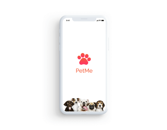
Introduction
A few months ago I was suffering from mental health problems while going through the phase I noticed that I was binging on dog videos since for a brief moment of time, they made me happy.
While binging I came across a video by Yes Theory in which they adopt a dog for 11 days. But they had to give up because of their lifestyle.
I felt that many are going through similar problems where people want to adopt a pet but aren't able to do so because either they aren't ready yet to commit to it or due to financial constraints.
That's how this idea was born, an app that connects people with therapy dogs in a shelter for a temporary period of time.
Hypothesis
Studies have shown that people who are going through mental health problems have problems accessing Therapy dogs.
Problem
Building an app that connects people with Therapy dogs..
My Roles
My Process
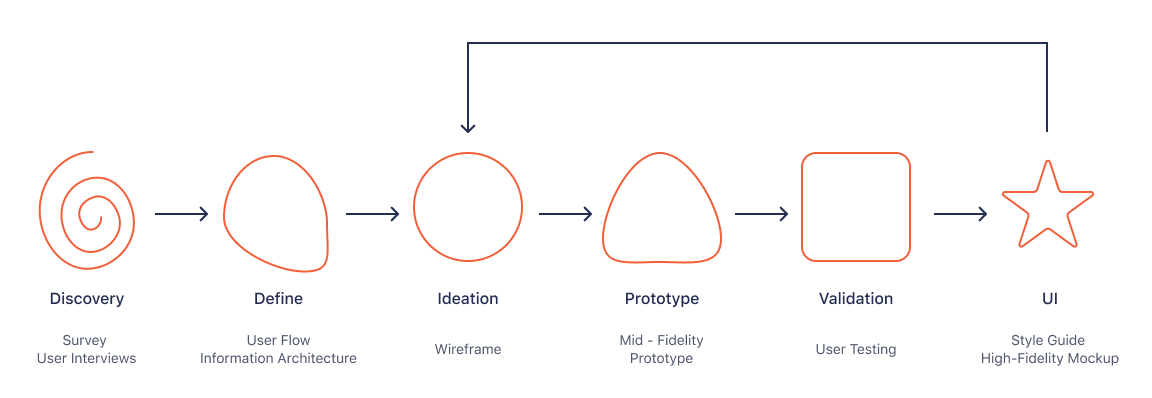
1. Discovery
User Research
I wanted to learn more about how stress co-relates with petting a dog so I conducted
an online survey that was completed by 34 participants.
Survey Questions
Do you like dogs ?
Do you own a dog ?
What’s your age ?
What’s your Gender ?
What's your current salary ?
On scale of 1 - 10, how stressed are you ?
Will spending time with dogs help you manage stress
Where would you prefer to spend time with Dogs
-
Do you like dogs ?
-
Do you own a dog ?
-
What’s your age ?
-
What’s your Gender ?
-
What's your current salary ?
-
On scale of 1 - 10, how stressed are you ?
-
Will spending time with dogs help you manage stress
-
Where would you prefer to spend time with Dogs
General Takeway
-
People who are suffering from stress feel that owning a dog might help them.
-
People want to own a dog but aren't ready to commit to it since it comes with overhead responsibilities.
Persona
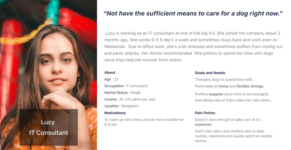
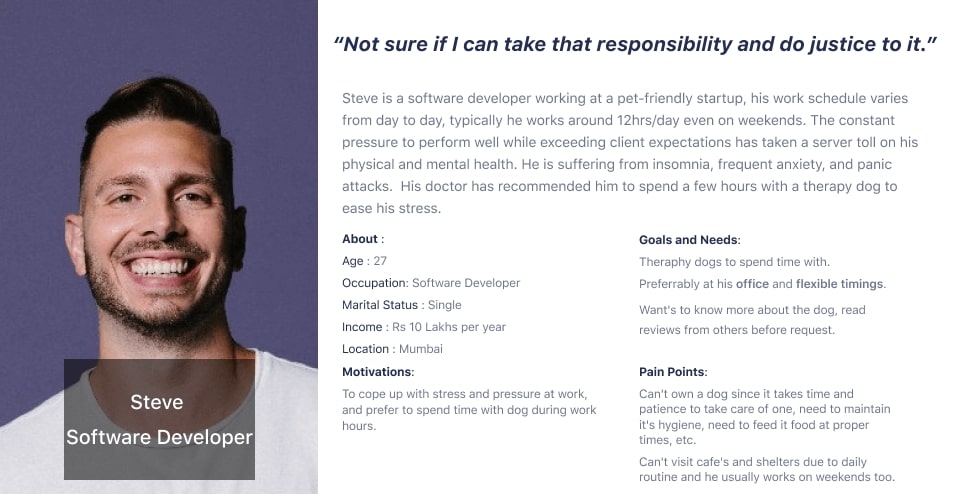
Based on user research, I created 2 personas. Meet Lucy and Steve.
2. Define
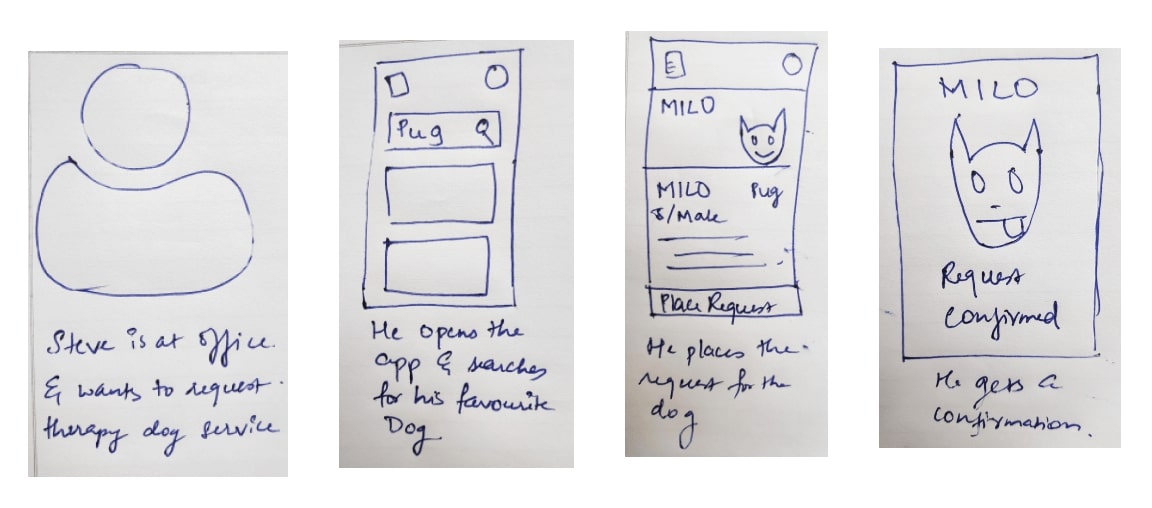
Story Board
To visualize the general use case I create a small storyboard of a user requesting the service.
Brainstorming Features
The next step was to put the knowledge from research in motion to define the app's functions, user flows and design the prototype.
App Functionalities
Search for therapy dogs
Explore available therapy dogs
Request a therapy dog
Account
Request history
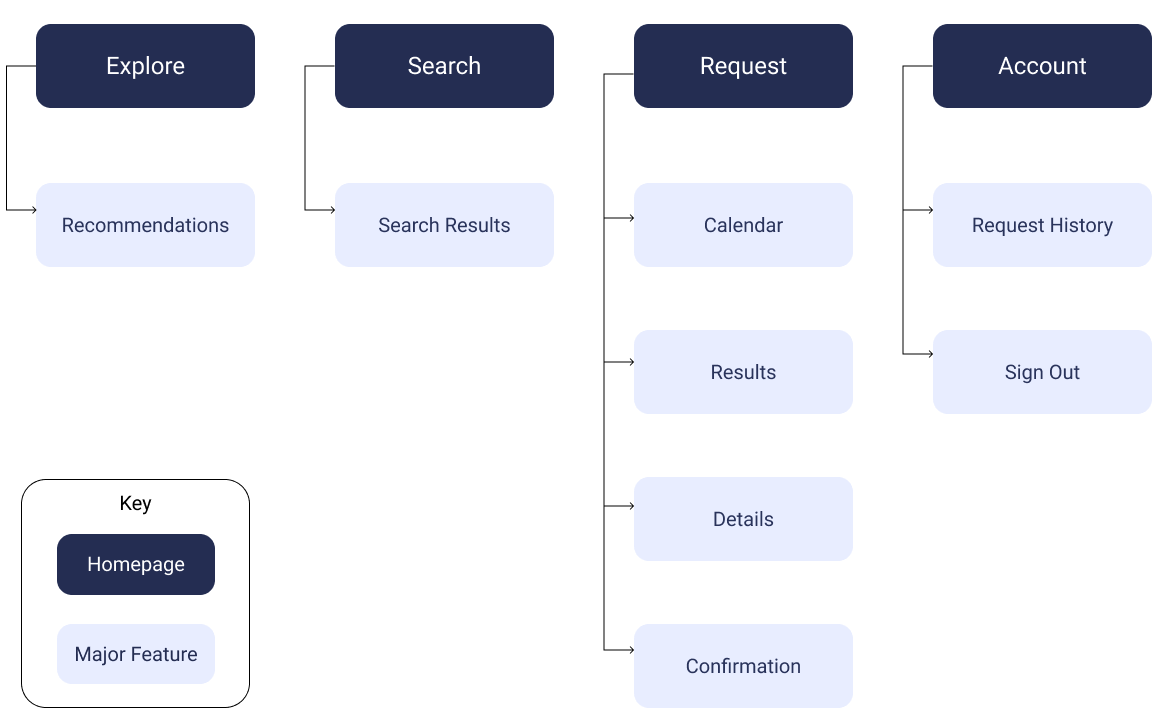
Information Architecture
After identifying a set of major functionalities required, I mapped out an information architecture to visualize the hierarchy of major and minor features.
It gave me an idea of how to organize content and how many in or screens it'll take to complete a task
User Flow
Next I created a user flows for all possible tasks.

3. Ideation
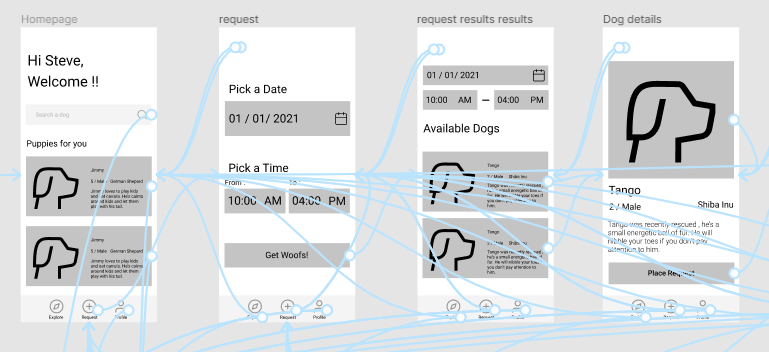
With enough information gathered I started with creating wireframes..
The prototype was designed in two iterations. The first part was implementing the following tasks :


Request

Search

5. Validate
User Test
I conducted user testing on my mid-fidelity prototype on a mobile phone to see how users would complete certain tasks once they were given some context.
I wanted to know if the tap and scroll were intuitive.
The goal was to identify pain points that could be improved in future iterations.
Tasks :


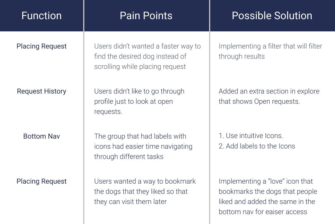
Affinity Mapping
After conducting user tests, I interviewed them regarding their experience and whether they wanted extra features , especially to people who do not use app yet. I organized my findings in an affinity map to identify the pain points and potential solutions that would be incorporated into future iterations.
Bottom Nav Analysis
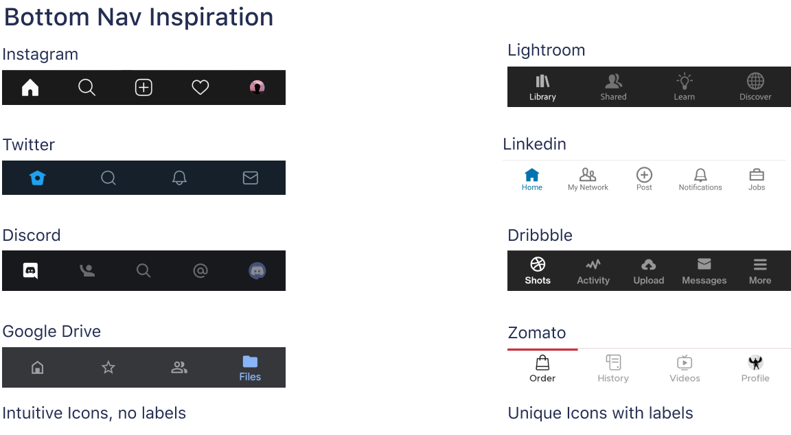
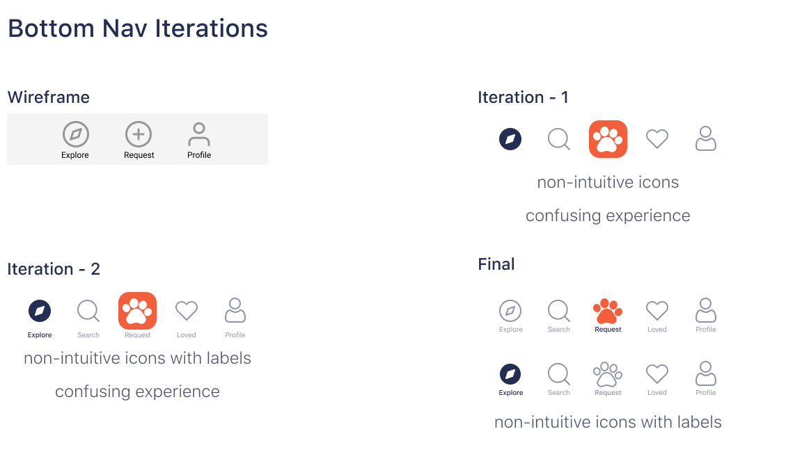
After implementing new features, I was still on hook regarding UI and UX for bottom nav so I carried out a series of tests and sought out inspiration from other apps
Inspiration
First I analyzed how other apps have implemented their bottom nav and why they did so.
Iterations
After gaining insight into how other apps have implemented their bottom nav, I carried out different iterations and came to the final design with my intuition
6. UI
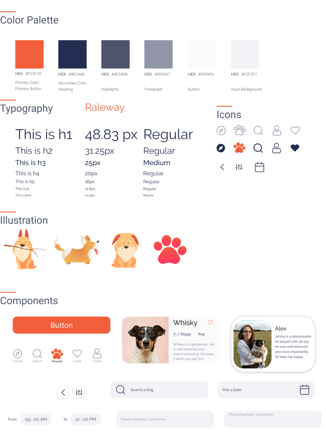
After working the changes into the wireframes, it was time to proceed with the visual design. Since dogs are friendly, energetic animals, I went for orange color as my primary color since orange represents excitement and pastel orange is a common color among dogs. To contrast well with it, I chose dark navy blue as my secondary color.
7. Lessons Learned
Coming up with a concept app was certainly a tricky project. First I wanted to make sure that there's a need for such app and that there's a market for it, turned out that many people want such services. Next big hurdle was ideation, since there are no competitor apps I had to go ahead with my intuition and build features.
Next big learning leap was testing and validation, during initial high fidelity test for bottom nav, I skeed out for inspiration from other products, understood why they were built a certain way and with help of continuous iterations I reached a middle ground where icons were unique and minimal to achieve an intuitive user experience.
“If you are not embarrassed by the first version of your product, you've launched too late"-Reid Hoffman.
My next big learning leap was shipping the minimum viable product and get into the hands of users, this helped in improving overall aesthetics, learn new Figma features, figure out new ways to implement functionality and solve interaction bugs.
8. Next Steps
My next step is to integrate adoption, shelter search, donation, volunteering, giving people options to browse dogs based on their needs and related functionalities.